2025 年 8 月 - shadcn CLI 3.0 和 MCP 服务器
我们刚刚发布了 shadcn CLI 3.0,支持命名空间注册表、高级身份验证、新命令和完全重写的注册表引擎。
新增功能
- 命名空间注册表 - 使用
@registry/name格式安装组件。 - 私有注册表 - 使用高级身份验证保护您的注册表。
- 搜索和发现 - 新命令可在安装前查找和查看代码。
- MCP 服务器 - 所有注册表的 MCP 服务器。
- 更快的全部 - 完全重写的注册表解析。
- 改进的错误处理 - 为用户和 LLM 提供更好的错误消息。
- 升级指南 - 现有用户的迁移说明。
命名空间注册表
3.0 版本最大的变化是命名空间注册表。您现在可以使用 @registry/name 格式从注册表(社区注册表、您公司的私有注册表或内部注册表)安装组件。
这使得在团队和项目之间分发代码变得更容易。
在您的 components.json 中配置注册表
{
"registries": {
"@acme": "https://acme.com/r/{name}.json",
"@internal": {
"url": "https://registry.company.com/{name}",
"headers": {
"Authorization": "Bearer ${REGISTRY_TOKEN}"
}
}
}
}然后使用 @registry/name 格式安装组件
它完全去中心化。没有中央注册机构。您可以创建任何您想要的命名空间,并根据团队的需求组织组件。
{
"registries": {
"@design": "https://registry.company.com/design/{name}.json",
"@engineering": "https://registry.company.com/eng/{name}.json",
"@marketing": "https://registry.company.com/marketing/{name}.json"
}
}组件甚至可以依赖于不同注册表中的资源。所有内容都会从正确的源自动解析和安装。
{
"name": "dashboard",
"type": "registry:block",
"registryDependencies": [
"@shadcn/card", // From default registry
"@v0/chart", // From v0 registry
"@acme/data-table", // From acme registry
"@lib/data-fetcher", // Utility library
"@ai/analytics-prompt" // AI prompt resource
]
}私有注册表
需要保持您的组件私有吗?我们已经为您准备好了。配置使用令牌、API 密钥或自定义标头的身份验证
{
"registries": {
"@private": {
"url": "https://registry.company.com/{name}.json",
"headers": {
"Authorization": "Bearer ${REGISTRY_TOKEN}"
}
}
}
}您的私有组件保持私有。非常适合拥有专有 UI 库的企业团队。
我们支持所有主要的身份验证方法:基本身份验证、Bearer 令牌、API 密钥查询参数和自定义标头。
有关更多详细信息,请参阅身份验证文档。
搜索与发现
三个新命令让您轻松找到所需
- 在安装前查看注册表中的项目
- 搜索注册表中的项目
- 列出注册表中的所有项目
在安装前预览组件。跨多个注册表搜索。提前查看代码和所有依赖项。
MCP 服务器

早在 4 月份,我们推出了第一个 MCP 服务器版本。从那时起,我们吸取了所有经验教训,构建了一个更好的 MCP 服务器。
新增功能如下:
- 适用于所有注册表。零配置
- 一键添加到您喜欢的 MCP 客户端
- 我们改进了底层工具
- 更好地与 CLI 和注册表集成
- 支持同一项目中的多个注册表
将 MCP 服务器添加到您的项目
有关更多详细信息,请参阅文档。
更快的全部
我们完全从头重写了注册表解析引擎。它更快、更智能,甚至可以处理最棘手的依赖树。
- 依赖解析速度提高达 3 倍
- 更智能的文件去重和合并
- 开箱即用的monorepo支持
- 注册表作者的
build命令已更新
改进的错误处理
注册表开发者现在可以提供自定义错误消息,以帮助用户(和 LLM)在出现问题时进行指导。CLI 会为常见问题显示有用的、可操作的错误
Unknown registry "@acme". Make sure it is defined in components.json as follows:
{
"registries": {
"@acme": "[URL_TO_REGISTRY]"
}
}缺少环境变量?CLI 会准确告诉你需要什么
Registry "@private" requires the following environment variables:
• REGISTRY_TOKEN
Set the required environment variables to your .env or .env.local file.注册表作者可以在其响应中提供自定义错误消息,以帮助用户和 AI 代理快速理解和修复问题。
Error:
You are not authorized to access the item at http://example.com/r/component.
Message:
[Unauthorized] Your API key has expired. Renew it at https://example.com/api/renew-key.升级指南
最棒的是:对用户来说没有破坏性更改。您现有的 components.json 文件工作方式完全相同。所有已安装的组件工作方式完全相同。
对于开发者,如果您直接使用程序化 API,我们已经弃用了一些函数,转而使用更好的函数
fetchRegistry→getRegistryresolveRegistryTree→resolveRegistryItems- Schema 从
shadcn/registry移动到shadcn/schema包
- import { registryItemSchema } from "shadcn/registry"
+ import { registryItemSchema } from "shadcn/schema"就是这样。真的。其他一切都正常工作。
2025 年 7 月 - 通用注册表项
我们已添加对通用注册表项的支持。这允许您创建可分发到任何项目的注册表项,即无需框架、无需 components.json、无需 tailwind、无需 react。
这种新的注册表项类型解锁了许多新的工作流程。您现在可以将代码、配置、规则、文档等任何内容分发到任何代码项目。
有关更多详细信息和示例,请参阅文档。
2025 年 7 月 - 本地文件支持
shadcn CLI 现在支持本地文件。从本地 JSON 文件初始化项目并添加组件、主题、钩子、实用程序等。
# Initialize a project from a local file
npx shadcn init ./template.json
# Add a component from a local file
npx shadcn add ./block.json此功能带来了强大的新工作流程
- 零设置 - 无需远程注册表
- 更快的开发 - 在发布前在本地测试注册表项
- 增强代理和 MCP 的工作流程 - 在本地生成和运行注册表项
- 私有组件 - 保持专有组件本地和私有。
2025 年 6 月 - radix-ui
我们添加了一个新命令,用于迁移到新的 radix-ui 包。此命令将所有 @radix-ui/react-* 导入替换为 radix-ui。
它将自动更新您的 ui 组件中的所有导入,并将 radix-ui 安装为依赖项。
- import * as AlertDialogPrimitive from "@radix-ui/react-dialog"
+ import { AlertDialog as AlertDialogPrimitive } from "radix-ui"运行命令后,请务必测试您的组件和项目。
注意:要更新新添加组件的导入,请再次运行迁移命令。
2025 年 6 月 - 日历组件
我们已将 Calendar 组件升级到最新版本的 React DayPicker。
这是一次重大升级,包含了许多新功能和改进。我们还构建了 30 多个日历区块,您可以使用它们来构建自己的日历组件。
请参阅区块库页面中的所有日历区块。

要将您的项目升级到最新版本的 Calendar 组件,请参阅升级指南。
2025 年 5 月 - 新网站
我们已将 ui.shadcn.com 升级到 Next.js 15.3 和 Tailwind v4。该网站现在使用升级后的 new-york 组件。
我们还对设计进行了一些细微更新,以使网站更快、更易于导航。
这次升级解锁了我们正在开发的许多新功能。更多内容即将推出。
2025 年 4 月 - MCP
我们正在为 shadcn/ui 注册表开发零配置 MCP 支持。一个命令 npx shadcn registry:mcp 即可使任何注册表与 mcp 兼容。
在此线程中了解更多信息。
2025 年 3 月 - shadcn 2.5.0
本周早些时候,我们标记了 shadcn 2.5.0。它带有一个非常酷的功能:随处解析。
注册表现在可以将文件放置在应用程序的任何位置,我们将正确解析导入。无需拘泥于固定的文件结构。它甚至可以在注册表本身之外添加文件。
在安装时,我们会跟踪所有文件并执行多遍解析以正确处理导入和别名。它速度很快。
2025 年 3 月 - 跨框架路由支持
shadcn CLI 现在可以自动检测您的框架并为您调整路由。
适用于所有框架,包括 Laravel、Vite 和 React Router。
2025 年 2 月 - Tailwind v4
我们发布了 Tailwind v4 和 React 19 的第一个预览版。您可以立即尝试使用。
新增功能
- CLI 现在可以使用 Tailwind v4 初始化项目。
- 完全支持新的 @theme 指令和 @theme 内联选项。
- 所有组件都已针对 Tailwind v4 和 React 19 进行了更新。
- 我们删除了 forwardRefs 并调整了类型。
- 现在每个原始元素都具有用于样式的 data-slot 属性。
- 我们修复并清理了组件的样式。
- 我们正在弃用 toast 组件,转而使用 sonner。
- 按钮现在使用默认光标。
- 我们正在弃用默认样式。新项目将使用 new-york。
- HSL 颜色现在转换为 OKLCH。
在文档中阅读更多内容。
2025 年 2 月 - 更新注册表 Schema
我们正在更新注册表 Schema 以支持更多功能。
将代码定义为平面 JSON 文件并通过 CLI 分发。
- 自定义样式:自带设计系统、组件和令牌
- 扩展、覆盖、混合和匹配来自第三方注册表和 LLM 的组件
- 安装主题、CSS 变量、钩子、动画以及 Tailwind 层和实用程序
2025 年 1 月 - 区块
我们正在邀请社区为区块库做出贡献。与其他开发者分享您的组件和区块,并帮助构建一个高质量、可重用组件的库。
我们希望看到所有类型的区块:应用程序、营销、产品等等。
请参阅文档页面以开始使用。
2024 年 12 月 - Monorepo 支持
到目前为止,在 monorepo 中使用 shadcn/ui 有点痛苦。您可以使用 CLI 添加组件,但必须管理组件的安装位置并手动修复导入路径。
通过 CLI 中新增的 monorepo 支持,我们使在 monorepo 中使用 shadcn/ui 变得更加容易。
CLI 现在了解 monorepo 结构,并将组件、依赖项和注册表依赖项安装到正确的路径,并为您处理导入。
在文档中阅读更多内容。
2024 年 11 月 - 图标
图标更新。新纽约风格现在使用 Lucide 作为默认图标集。
- 新项目默认使用 Lucide
- 现有项目没有破坏性更改
- 使用 CLI (可选) 将原语迁移到 Lucide
有关我们这样做的更多信息,请参阅线程。
2024 年 10 月 - React 19
shadcn/ui 现在兼容 React 19 和 Next.js 15。
我们发布了一份指南,帮助您将项目升级到 React 19。
2024 年 10 月 - 侧边栏
介绍 sidebar.tsx:25 个组件可帮助您构建各种侧边栏。
我不喜欢构建侧边栏。所以我构建了 30 多个。所有类型。然后将核心简化为 sidebar.tsx:一个强大的构建基础。
它适用于 Next.js、Remix、Vite 和 Laravel。
2024 年 8 月 - npx shadcn init
新的 CLI 现已可用。它是一个完整的重写,具有许多新功能和改进。您现在可以使用 npx shadcn add 安装组件、主题、钩子、实用程序等。
这是朝着分发您和您的 LLM 可以访问和使用的代码迈出的重要一步。
- 首先,CLI 现在开箱即用地支持所有主要的 React 框架:Next.js、Remix、Vite 和 Laravel。当您初始化新应用程序时,我们会更新您现有的 Tailwind 文件,而不是覆盖它们。
- 组件现在附带自己的依赖项。以手风琴为例,它可以定义其 Tailwind 关键帧。当您将其添加到项目中时,我们会相应地更新您的 tailwind.config.ts 文件。
- 您还可以使用 URL 安装远程组件。
npx shadcn add https://acme.com/registry/navbar.json。 - 我们还改进了 init 命令。它具有框架检测功能,甚至可以在一个命令中初始化一个全新的 Next.js 应用程序。
npx shadcn init。 - 我们创建了一个新的 Schema,您可以使用它来发布自己的组件注册表。由于它支持 URL,您甚至可以使用它来分发私有组件。
- 还有一些其他更新,例如更好的错误处理和 monorepo 支持。
您今天就可以试用新的 CLI。
更新您的项目
要将现有项目更新为使用新的 CLI,请更新您的 components.json 文件,以包含 components、utils、ui、lib 和 hooks 的导入别名。
{
"$schema": "https://ui.shadcn.org.cn/schema.json",
"style": "new-york",
"tailwind": {
// ...
},
"aliases": {
"components": "@/components",
"utils": "@/lib/utils",
"ui": "@/components/ui",
"lib": "@/lib",
"hooks": "@/hooks"
}
}如果您使用不同的导入别名前缀,例如 ~,请将 @ 替换为您的前缀。
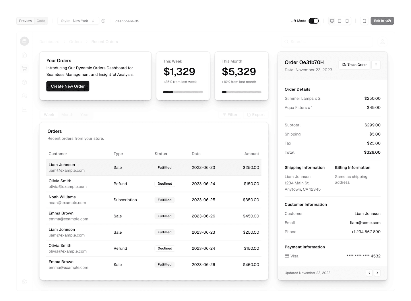
2024 年 4 月 - 引入 Lift 模式
我们正在为区块引入一种新模式,称为Lift 模式。
启用 Lift 模式以自动从区块模板中“提取”较小的组件以进行复制和粘贴。
 查看区块库
查看区块库

通过 Lift 模式,您将能够复制构成区块模板的较小组件,例如卡片、按钮和表单,并将它们直接粘贴到您的项目中。
访问区块页面试用。
2024 年 3 月 - 引入区块
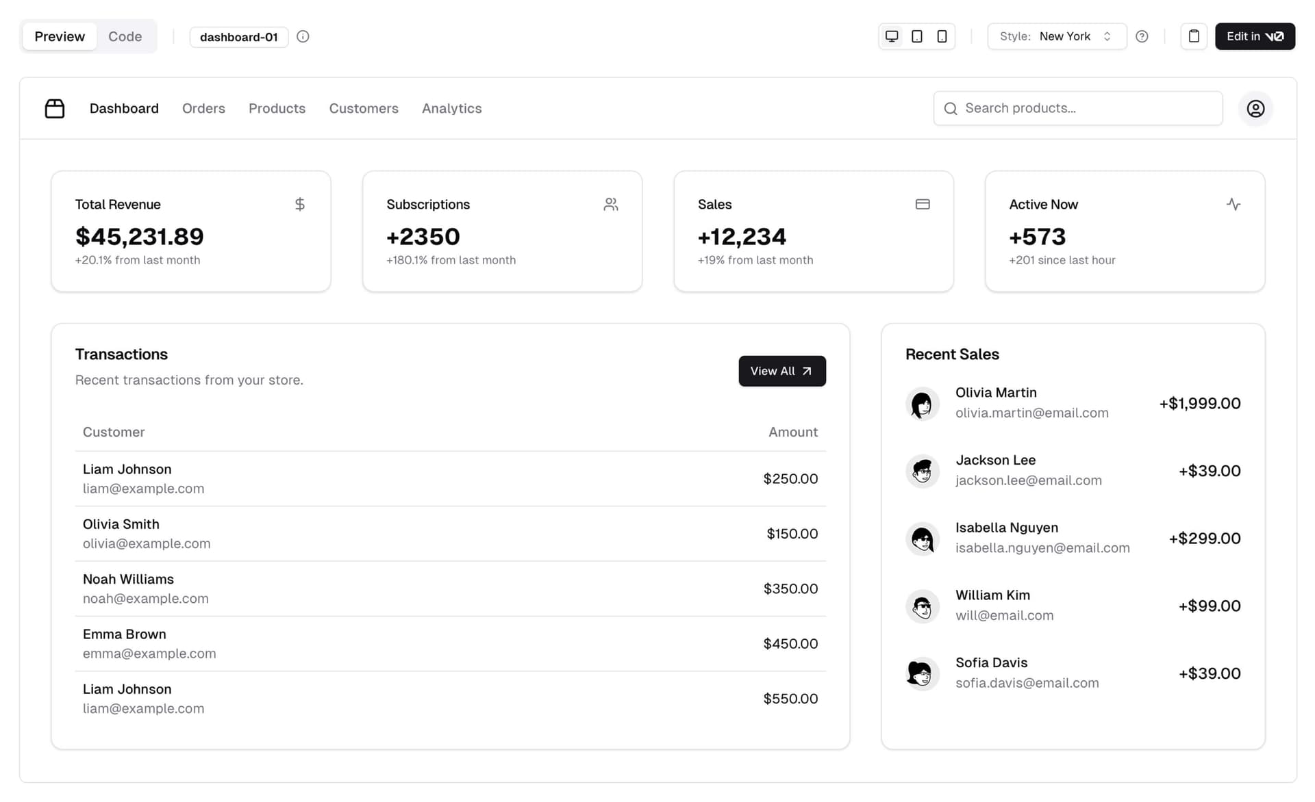
自发布以来最受欢迎的功能之一是布局:带有侧边栏的管理员仪表板、营销页面部分、卡片等。
今天,我们正在推出区块.
 查看区块库
查看区块库

区块是现成的组件,可用于构建您的应用程序。它们完全响应式、可访问且可组合,这意味着它们是使用与 shadcn/ui 中其他组件相同的原则构建的。
我们从仪表板布局和身份验证页面开始,并计划在未来几周内添加更多区块。
开源
区块是开源的。您可以在 GitHub 上找到源代码。在您的项目中使用它们,自定义它们并回馈。
 查看区块库
查看区块库

请求区块
我们还引入了一个“请求区块”功能。如果您想看到特定的区块,只需在 GitHub 上创建一个请求,社区就可以点赞并构建它。
 查看区块库
查看区块库

v0
如果您有 v0 账户,您可以使用 Edit in v0 功能在 v0 上打开代码进行提示和进一步生成。
就是这样。期待看到您使用 Blocks 构建的作品。
2024 年 3 月 - 面包屑和 OTP 输入
我们添加了一个新的面包屑组件和一个 OTP 输入组件。
面包屑
一个可访问且灵活的面包屑组件。它支持折叠项、自定义分隔符、自带路由 <Link />,并可与其他 shadcn/ui 组件组合。
输入 OTP
一个功能齐全的 OTP 输入组件。它支持数字和字母数字代码、自定义长度、复制粘贴和辅助功能。OTP 输入构建于 input-otp 之上,由 @guilherme_rodz 创建。
如果您有 v0,则新组件可用于生成。
2023 年 12 月 - 新组件、CLI 等
我们为 shadcn/ui 添加了新组件,并对 CLI 进行了许多改进。
以下是新功能的快速概览
- 走马灯 - 一个具有动画、滑动手势和键盘支持的走马灯组件。
- 抽屉 - 一个在移动设备上看起来很棒的抽屉组件。
- 分页 - 一个带有页面导航、上一页和下一页按钮的分页组件。
- 可调整大小 - 一个可调整大小的组件,用于构建可调整大小的面板组和布局。
- Sonner - 您将需要的最后一个 toast 组件。
- CLI 更新 - 支持自定义 Tailwind 前缀 和
tailwind.config.ts。
走马灯
我们添加了一个功能齐全的走马灯组件,支持动画、滑动手势和键盘操作。基于 Embla Carousel 构建。
它支持无限循环、自动播放、垂直方向等。
抽屉
啊,抽屉组件 😍。基于 Vaul,由 emilkowalski_ 创建。
尝试在移动设备上打开以下抽屉。它看起来棒极了!
分页
我们添加了一个分页组件,带有页面导航、上一页和下一页按钮。它简单、灵活,并且适用于您框架的 <Link /> 组件。
可调整大小
使用此 <Resizable /> 组件构建可调整大小的面板组和布局。
<Resizable /> 使用 react-resizable-panels 构建,由 bvaughn 创建。它支持鼠标、触摸和键盘。
Sonner
emilkowalski_ 的又一个作品。您将需要的最后一个 toast 组件。Sonner 现已在 shadcn/ui 中提供。
CLI 更新
这是最受欢迎的功能之一。您现在可以配置自定义 Tailwind 前缀,CLI 将在添加组件时自动为您的实用程序类添加前缀。
这意味着您现在可以轻松地将 shadcn/ui 组件添加到 Docusaurus、Nextra 等现有项目中。无需冲突,即可直接用于您现有的设计系统。🔥
<AlertDialog className="tw-grid tw-gap-4 tw-border tw-bg-background tw-shadow-lg" />它适用于 cn、cva 和 CSS 变量。
CLI 现在还可以检测 tailwind.config.ts 并为您添加配置的 TypeScript 版本。
就是这样。节日快乐。
2023 年 7 月 - JavaScript
此项目和组件是用 TypeScript 编写的。我们也建议您的项目使用 TypeScript。
但是,我们提供了一个 JavaScript 版本的组件,可通过 CLI 获取。
Would you like to use TypeScript (recommended)? no要选择不使用 TypeScript,您可以在 components.json 文件中使用 tsx 标志。
{
"style": "default",
"tailwind": {
"config": "tailwind.config.js",
"css": "src/app/globals.css",
"baseColor": "zinc",
"cssVariables": true
},
"rsc": false,
"tsx": false,
"aliases": {
"utils": "~/lib/utils",
"components": "~/components"
}
}要配置导入别名,您可以使用以下 jsconfig.json
{
"compilerOptions": {
"paths": {
"@/*": ["./*"]
}
}
}2023 年 6 月 - 新 CLI、样式及更多
我今天有很多更新要与您分享
- 新 CLI - 从头重写了 CLI。您现在可以添加组件、依赖项和配置导入路径。
- 主题 - 选择使用 CSS 变量或 Tailwind CSS 实用程序类进行主题设置。
- 基本颜色 - 为您的项目配置基本颜色。这将用于生成组件的默认调色板。
- React 服务器组件 - 选择不使用 React 服务器组件。CLI 将自动附加或删除
use client指令。 - 样式 - 引入了一个名为“样式”的新概念。样式带有自己的一组组件、动画、图标等。
- 退出动画 - 为所有组件添加了退出动画。
- 其他更新 - 新的
icon按钮大小,更新的sheet组件等。 - 更新您的项目 - 如何更新您的项目以获取最新更改。
新 CLI
在过去的几周里,我一直在开发一个新的 CLI。它是一个完整的重写。它带来了许多新功能和改进。
初始化
运行 init 命令时,系统会询问您几个问题以配置 components.json
Which style would you like to use? › Default
Which color would you like to use as base color? › Slate
Where is your global CSS file? › › app/globals.css
Do you want to use CSS variables for colors? › no / yes
Where is your tailwind.config.js located? › tailwind.config.js
Configure the import alias for components: › @/components
Configure the import alias for utils: › @/lib/utils
Are you using React Server Components? › no / yes此文件包含有关您的所有组件的信息:它们的安装位置、导入路径、样式设置方式等等。
您可以使用此文件更改组件的导入路径、设置 baseColor 或更改样式方法。
{
"style": "default",
"tailwind": {
"config": "tailwind.config.ts",
"css": "src/app/globals.css",
"baseColor": "zinc",
"cssVariables": true
},
"rsc": false,
"aliases": {
"utils": "~/lib/utils",
"components": "~/components"
}
}这意味着您现在可以使用 CLI 和任何目录结构,包括 src 和 app 目录。
添加
现在 add 命令功能更强大。您现在可以添加 UI 组件,还可以导入更复杂的组件(即将推出)。
CLI 将自动解析所有组件和依赖项,根据您的自定义配置格式化它们,并将它们添加到您的项目中。
diff(实验性)
我们还引入了一个新的 diff 命令,以帮助您跟踪上游更新。
您可以使用此命令查看上游仓库发生了哪些更改,并相应地更新您的项目。
运行 diff 命令以获取可用更新的组件列表
The following components have updates available:
- button
- /path/to/my-app/components/ui/button.tsx
- toast
- /path/to/my-app/components/ui/use-toast.ts
- /path/to/my-app/components/ui/toaster.tsx然后运行 diff [component] 查看更改
const alertVariants = cva(
- "relative w-full rounded-lg border",
+ "relative w-full pl-12 rounded-lg border"
)使用 CSS 变量或 Tailwind 颜色进行主题设置
您可以选择使用 CSS 变量或 Tailwind CSS 实用程序类进行主题设置。
当您添加新组件时,CLI 将根据您的 components.json 配置自动使用正确的主题设置方法。
实用程序类
<div className="bg-zinc-950 dark:bg-white" />要在主题设置中使用实用程序类,请在您的 components.json 文件中将 tailwind.cssVariables 设置为 false。
{
"tailwind": {
"config": "tailwind.config.js",
"css": "app/globals.css",
"baseColor": "slate",
"cssVariables": false
}
}CSS 变量
<div className="bg-background text-foreground" />要在主题设置中使用 CSS 变量类,请在您的 components.json 文件中将 tailwind.cssVariables 设置为 true。
{
"tailwind": {
"config": "tailwind.config.js",
"css": "app/globals.css",
"baseColor": "slate",
"cssVariables": true
}
}基本颜色
您现在可以为您的项目配置基本颜色。这将用于生成组件的默认调色板。
{
"tailwind": {
"config": "tailwind.config.js",
"css": "app/globals.css",
"baseColor": "zinc",
"cssVariables": false
}
}从 gray、neutral、slate、stone 或 zinc 中选择。
如果您将 cssVariables 设置为 true,我们会在您的 globals.css 文件中将基本颜色设置为 CSS 变量。如果您将 cssVariables 设置为 false,我们会在您的组件中内联 Tailwind CSS 实用程序类。
React 服务器组件
如果您使用的框架不支持 React 服务器组件,您现在可以通过将 rsc 设置为 false 来选择退出。我们将在添加组件时自动附加或删除 use client 指令。
{
"rsc": false
}样式
我们正在引入一个名为“样式”的新概念。
您可以将样式视为视觉基础:形状、图标、动画和排版。 样式带有自己的一组组件、动画、图标等。
我们正在发布两种样式:default 和 new-york(更多样式即将推出)。
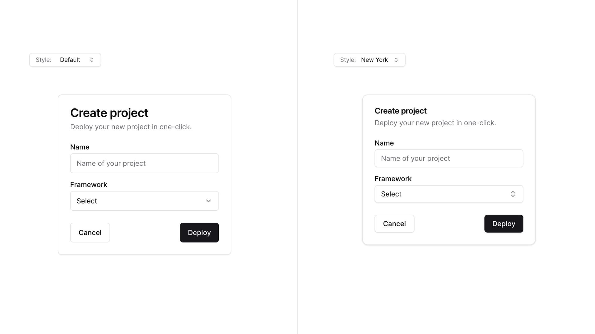
default 样式是您习惯的样式。这是我们从项目开始就一直在使用的样式。它使用 lucide-react 作为图标,使用 tailwindcss-animate 作为动画。
new-york 样式是一种新样式。它配备了更小的按钮、带阴影的卡片和一套新的 Radix 图标。
当您运行 init 命令时,系统会询问您想要使用哪种样式。这会保存在您的 components.json 文件中。
{
"style": "new-york"
}主题
从一种样式作为基础开始,然后使用 CSS 变量或 Tailwind CSS 实用程序类进行主题设置,以完全改变组件的外观。

退出动画
我为所有组件添加了退出动画。点击下面的组合框即可看到微妙的退出动画。
动画可以使用实用程序类进行自定义。
其他更新
按钮
- 添加了一个新的按钮尺寸
icon
表单
- 将
position重命名为side以匹配其他元素。
- 删除了
size属性。使用className="w-[200px] md:w-[450px]"进行响应式尺寸设置。
更新您的项目
由于我们采用复制粘贴的方式,您需要手动更新您的项目才能获取最新更改。
注意:我们正在开发一个 diff 命令,以帮助您跟踪上游更新。
添加 components.json
在根目录下创建 components.json 文件
{
"style": "default",
"rsc": true,
"tailwind": {
"config": "tailwind.config.js",
"css": "app/globals.css",
"baseColor": "slate",
"cssVariables": true
},
"aliases": {
"components": "@/components",
"utils": "@/lib/utils"
}
}更新 tailwind.css 和 aliases 的值以匹配您的项目结构。
按钮
将 icon 大小添加到 buttonVariants
const buttonVariants = cva({
variants: {
size: {
default: "h-10 px-4 py-2",
sm: "h-9 rounded-md px-3",
lg: "h-11 rounded-md px-8",
icon: "h-10 w-10",
},
},
})表单
- 将
sheet.tsx的内容替换为以下内容
"use client"
import * as React from "react"
import * as SheetPrimitive from "@radix-ui/react-dialog"
import { cva, type VariantProps } from "class-variance-authority"
import { X } from "lucide-react"
import { cn } from "@/lib/utils"
const Sheet = SheetPrimitive.Root
const SheetTrigger = SheetPrimitive.Trigger
const SheetClose = SheetPrimitive.Close
const SheetPortal = ({
className,
...props
}: SheetPrimitive.DialogPortalProps) => (
<SheetPrimitive.Portal className={cn(className)} {...props} />
)
SheetPortal.displayName = SheetPrimitive.Portal.displayName
const SheetOverlay = React.forwardRef<
React.ElementRef<typeof SheetPrimitive.Overlay>,
React.ComponentPropsWithoutRef<typeof SheetPrimitive.Overlay>
>(({ className, ...props }, ref) => (
<SheetPrimitive.Overlay
className={cn(
"bg-background/80 data-[state=open]:animate-in data-[state=closed]:animate-out data-[state=closed]:fade-out-0 data-[state=open]:fade-in-0 fixed inset-0 z-50 backdrop-blur-sm",
className
)}
{...props}
ref={ref}
/>
))
SheetOverlay.displayName = SheetPrimitive.Overlay.displayName
const sheetVariants = cva(
"fixed z-50 gap-4 bg-background p-6 shadow-lg transition ease-in-out data-[state=open]:animate-in data-[state=closed]:animate-out data-[state=closed]:duration-300 data-[state=open]:duration-500",
{
variants: {
side: {
top: "inset-x-0 top-0 border-b data-[state=closed]:slide-out-to-top data-[state=open]:slide-in-from-top",
bottom:
"inset-x-0 bottom-0 border-t data-[state=closed]:slide-out-to-bottom data-[state=open]:slide-in-from-bottom",
left: "inset-y-0 left-0 h-full w-3/4 border-r data-[state=closed]:slide-out-to-left data-[state=open]:slide-in-from-left sm:max-w-sm",
right:
"inset-y-0 right-0 h-full w-3/4 border-l data-[state=closed]:slide-out-to-right data-[state=open]:slide-in-from-right sm:max-w-sm",
},
},
defaultVariants: {
side: "right",
},
}
)
interface SheetContentProps
extends React.ComponentPropsWithoutRef<typeof SheetPrimitive.Content>,
VariantProps<typeof sheetVariants> {}
const SheetContent = React.forwardRef<
React.ElementRef<typeof SheetPrimitive.Content>,
SheetContentProps
>(({ side = "right", className, children, ...props }, ref) => (
<SheetPortal>
<SheetOverlay />
<SheetPrimitive.Content
ref={ref}
className={cn(sheetVariants({ side }), className)}
{...props}
>
{children}
<SheetPrimitive.Close className="ring-offset-background focus:ring-ring data-[state=open]:bg-secondary absolute top-4 right-4 rounded-sm opacity-70 transition-opacity hover:opacity-100 focus:ring-2 focus:ring-offset-2 focus:outline-none disabled:pointer-events-none">
<X className="h-4 w-4" />
<span className="sr-only">Close</span>
</SheetPrimitive.Close>
</SheetPrimitive.Content>
</SheetPortal>
))
SheetContent.displayName = SheetPrimitive.Content.displayName
const SheetHeader = ({
className,
...props
}: React.HTMLAttributes<HTMLDivElement>) => (
<div
className={cn(
"flex flex-col space-y-2 text-center sm:text-left",
className
)}
{...props}
/>
)
SheetHeader.displayName = "SheetHeader"
const SheetFooter = ({
className,
...props
}: React.HTMLAttributes<HTMLDivElement>) => (
<div
className={cn(
"flex flex-col-reverse sm:flex-row sm:justify-end sm:space-x-2",
className
)}
{...props}
/>
)
SheetFooter.displayName = "SheetFooter"
const SheetTitle = React.forwardRef<
React.ElementRef<typeof SheetPrimitive.Title>,
React.ComponentPropsWithoutRef<typeof SheetPrimitive.Title>
>(({ className, ...props }, ref) => (
<SheetPrimitive.Title
ref={ref}
className={cn("text-foreground text-lg font-semibold", className)}
{...props}
/>
))
SheetTitle.displayName = SheetPrimitive.Title.displayName
const SheetDescription = React.forwardRef<
React.ElementRef<typeof SheetPrimitive.Description>,
React.ComponentPropsWithoutRef<typeof SheetPrimitive.Description>
>(({ className, ...props }, ref) => (
<SheetPrimitive.Description
ref={ref}
className={cn("text-muted-foreground text-sm", className)}
{...props}
/>
))
SheetDescription.displayName = SheetPrimitive.Description.displayName
export {
Sheet,
SheetTrigger,
SheetClose,
SheetContent,
SheetHeader,
SheetFooter,
SheetTitle,
SheetDescription,
}- 将
position重命名为side
- <Sheet position="right" />
+ <Sheet side="right" />谢谢
我要感谢所有一直在使用、提供反馈并为本项目做出贡献的人。我非常感谢。谢谢🙏